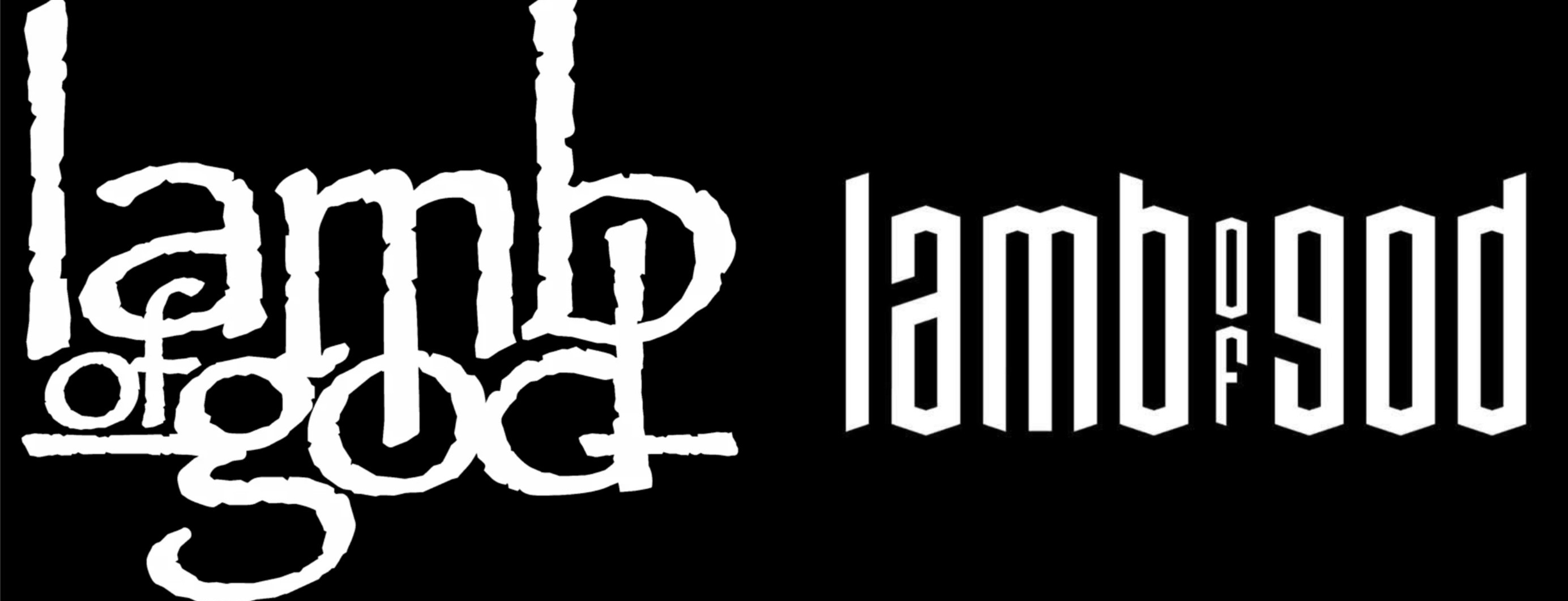
During an interview with WMMR, Lamb Of God guitarist Mark Morton discussed the band’s logo change. According to him, the old design “felt a little dated” and they wanted “something graphically that feels unique” for their new album “Into Oblivion.”
Morton said the following:
“Such a controversy around the logo… I love it.
The old logo was — it’s not gone. It’s on every t-shirt [that fans are still wearing when they come to our shows]. It’s not like we buried it. It just felt a little dated, you know what I mean?
And we feel really fresh about this record and we were just, like, ‘Let’s do something aesthetically, something graphically that feels unique for this project.’ And then everyone’s, like, ‘This cover sucks. It looks like 2000s art. The logo sucks.’ And I’m just, like, ‘Well, this is great.’ Because if the worst thing they have to say about the record is that they don’t like the logo, then we’re in great shape.”
This news comes after frontman Randy Blythe previously commented on the old logo, saying it had the band “looking like a falafel restaurant menu.”
[via Blabbermouth]

You must be logged in to post a comment.